Responsive grid with images or cards
2020 February 24
CSSHTML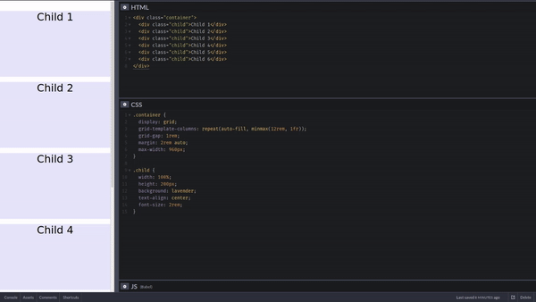
The magic to make it act that way is the two css lines below.
display: grid;
grid-template-columns: repeat(auto-fill, minmax(20rem, 1fr));
Put this on the parent container and this will give you a responsive grid that adapts the columns with the size of the container.
Here is the whole code example to check out.